To all who have followed my previous journeys, this one is slightly different. It takes place in a U.S. classroom and features me trying my hand at being a digital product designer. I stumbled upon this class when my Latin class was cancelled last-minute – due to low enrollment if you can you believe it – leaving me scrambling to find something to fit my schedule. In any case, I find myself incredibly thankful for stumbling upon this class because it’s opened my eyes to a whole new world, a world in which I never thought I would find myself in. And although I could probably write an entire blog post about all the interesting things I learned throughout the semester, I will instead describe my creative process for one of the projects I completed for this class.
One of the most difficult parts of the entire project was coming up with a problem to solve, a gap in the digital world in which I could pour my creative energies. The idea for this app came to me when my friend was lamenting the fact that no one was utilizing the Google Excel sheet she had prepared, dedicated to recording all the wines we purchased from Trader Joe’s. Our goal was to test all the different wines and document the price, our rating, and our overall thoughts for each. The problem was that no one was actually using the Excel sheet because, let’s face it, Excel spreadsheets are boring. It just resonates with boring, academic associations and that was definitely not the vibe we were trying to capture. So, I thought that I would create an app for wine connoisseurs and beer lovers, people who want to keep track of all the different types of beverages they’ve tried.
As I thought more about this, and with the good advice of one, wonderful ENTR 390 TA, I realized that I didn’t have to limit my app to just beverages. It could be geared for other interests like books, movies, or podcasts, really any interest that someone might want to keep a record of. I took some inspiration from the website GoodReads, a “social cataloguing” site that acts as a digital bookshelf for all the books you’ve read and want to read. The problem with this website is that it’s only for books and the design is sort of clunky and only a handful (literally) of people I know actually use it. It’s also web-based and doesn’t have a mobile app. But, to its credit, I did like the social aspect so I thought that being able to see your friends’ lists and interests could be a valuable addition to my own app.
So, I arrived at this problem statement:
Book fanatics, wine connoisseurs, and movie feigns (i.e. people who keep track of their interests) want something to make customizable lists to track their progress and commentary/thoughts/ratings in a social way so that they can keep records for themselves and also share them with friends and other like-minded souls.
And the persona I was designing for was the lovely Cecelia:
Cecelia, 26 years old, recently graduated with a Masters in Graphic Design and just employed at a start-up in LA, California. She is single and ready to enjoy life out of school. She considers herself to be a wine aficionado and a voracious reader, and wants something to keep track of all the wines and books she’s tried with her thoughts and comments. She also has a lot of friends in the area and wants to see what types of wines her friends are drinking and what books they’re reading with their recommendations and thoughts.
I tried to focus on four major functions: the home screen, where one could see recently updated lists and their friends’ lists; a profile screen, where one could update their information and connect via Facebook and Google+; the friends screen, where one could search through their friends, add friends, etc.; and a ‘My lists’ screen, where one could add and edit their own lists. Here are what some of the original wireframes looked like:
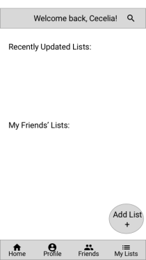
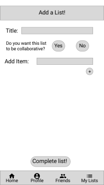
(Home Screen) (Add a List Screen)
I quickly realized, however, that making this a social app would be really complicated. During a valuable peer review session in class, my classmates kept bringing up important questions like: “What will the privacy settings be like?”, “How do you add friends? Can anyone see your lists or are they private?”, “Can you follow the lists of famous people too?”
From these sorts of questions an important lesson entrenched itself into my mind: designers have to think about A LOT OF STUFF, especially when designing for functionality and utility. So, I decided that adding the social aspect to this app would be a project for the future, when I have more of a handle on the design process as a whole. Anyways, I went back to the designing board with a simpler goal and revised my problem statement:
Book fanatics, wine connoisseurs, and movie feigns (i.e. people who keep track of their interests) want something to make customizable lists to track their progress/commentary/thoughts/ratings so that they can keep records for themselves and not accidentally try something that they’ve already experienced.
And I also needed to change my persona:
Cecelia, 26 years old, recently graduated with a Masters in Graphic Design and just employed at a start-up in LA, California. She is single and ready to enjoy life out of school. She considers herself to be a wine aficionado and a voracious reader, and wants something to keep track of all the wines and books she’s tried with her thoughts and comments so that she can have a record of her experiences and not accidentally try something for the second time and also to refer back to when giving recommendations.
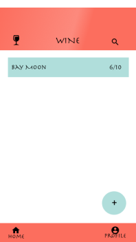
This change in direction really helped me focus on designing the most important aspects of the app, which were the adding lists function, adding items within those lists, the actual list screen, and the home screen. To help with designing these functions, I had some really good feedback from classmates about adding templates for popular lists people might make while also keeping the option to completely customize your own list. Here’s what the updated wireframes for the home page and the “add list” page looked like:
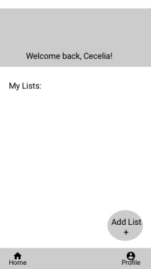
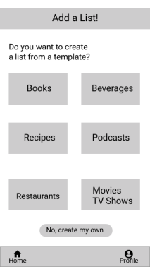
(Home Screen) (Add list from Template Screen)
I tried to keep the design simple and intuitive for whatever screen I was designing. I hoped that it would be simple enough to use that the app wouldn’t require any on-boarding, which is when the app takes you through a quick tutorial when you first open it up. I did this by only including the options of going to the profile screen or adding a list right from the home screen. Later, when you have added a list, you can access it right from the home screen. I also added text captions to all the icons at the bottom of the screen and to the “add list +” button so that it would be super clear to users where they were navigating to and what they were doing in the app.
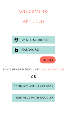
Some of the next considerations included the color scheme, font, and how to structure the actual lists themselves. For color, I wanted to have something fun and engaging but not obnoxious. For the font, I also wanted something fun but legible. I decided on ‘Herculanum’ partly because of its Classical associations but also because I thought it set the mood I was trying to capture – it was out of the ordinary but clearly legible. I also tried a few different color schemes and eventually landed one that was confirmed to be not super obnoxious from friends when I consulted them – it also made me think of warmer weather, which Michigan was in great need of at the time. I think the colors and fonts are best represented in my log-in screen:
For the actual list screen, I wanted it to be a dynamic experience. I made the upper banner a bit larger so it took up more screen and added some color effects to make it more engaging. I also decided that the items in the list would display the name of that item and it’s rating, which would make it easy to scroll up and down the list, looking for items of a certain ranking. But if you clicked on that item, it would expand and show the rest of the information. I perused the designs of some different apps and this expansion method seemed to be pretty popular. For example:
 ——>
——> 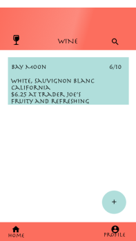
I also created an example for a book list but used stars as a rating because I wanted the user to be able to rate their items with whatever schema they felt like using. I thought this could be a cool and unique feature because a site like Goodreads has only one way to format a rating.
I think that if I had more time, I would play more with the list expansion design. I’m not entirely sure what I would do but I would prefer it to be slightly more engaging than it currently is. I wanted to avoid a spreadsheet layout but I think it could still be designed better. I let some of my friends play around with the prototype and they seemed to feel the same way. They also weren’t entirely satisfied with the color scheme. They additionally suggested that I indicate which fields in the list would actually be visible on the list page (i.e. the name and rating shown above) when the user is making a new list and include the option for users to move around the fields so they can decide what information is displayed on the un-expanded item in the list page.
Then for the second hardest part of the project: the title. I didn’t want it to be something boring like “My Interest Lists” or “Listful” or whatever. So, failing any further inspiration, I returned to my Latin roots to search for the answer. I settled on “Inventarium”, which is actually the Latin translation of list – so marginally better than the other options.
Here is the link to a demo of the project if you want to check it out:
Thanks for reading!

So interesting. So much I know little about. I tried this on paper years ago and of course it didn’t last and had little value.
LikeLike